Book Series Branding Design
Hover over video for playback controls
Designing a single book cover can be a tough process. Creating a look that can carry through a complete series can be even more challenging. What are the most important elements to create a consistent and compelling book series branding design?
Here are some highlights of my book series design work
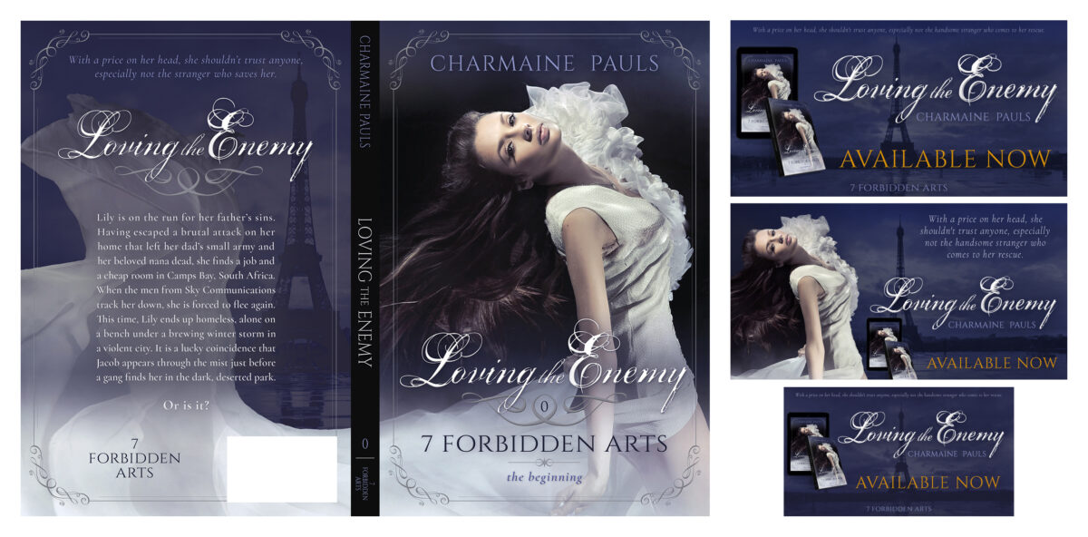
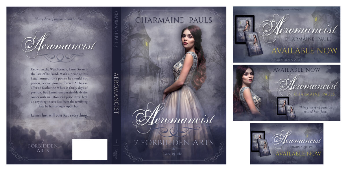
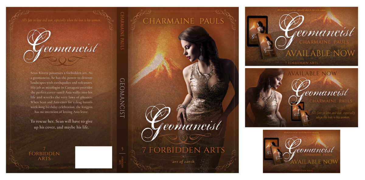
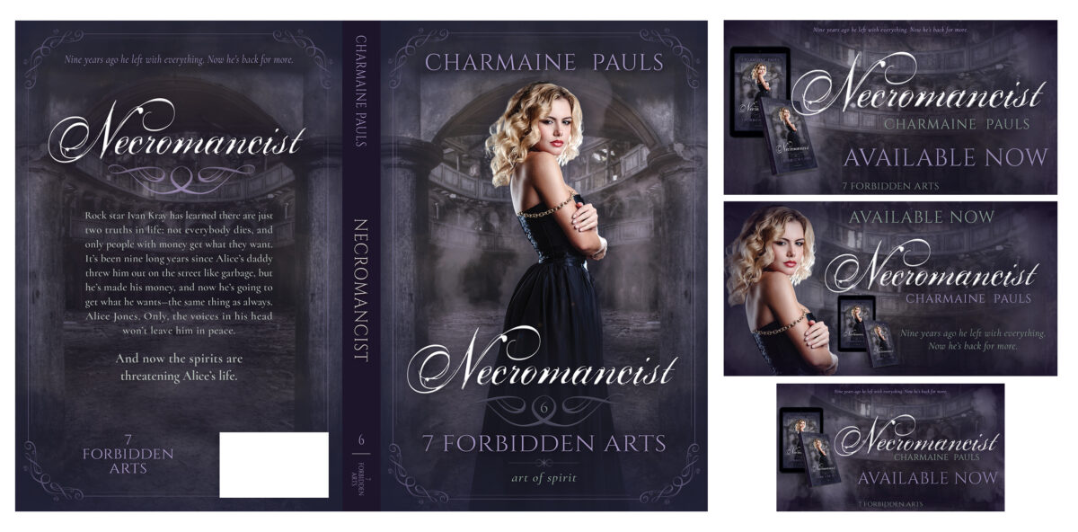
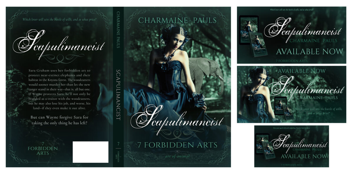
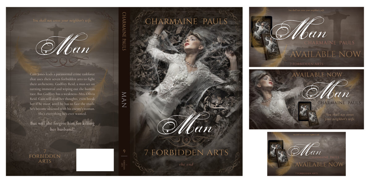
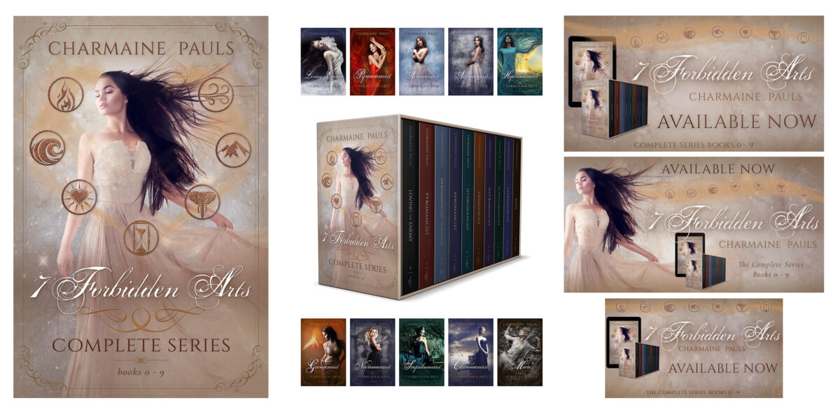
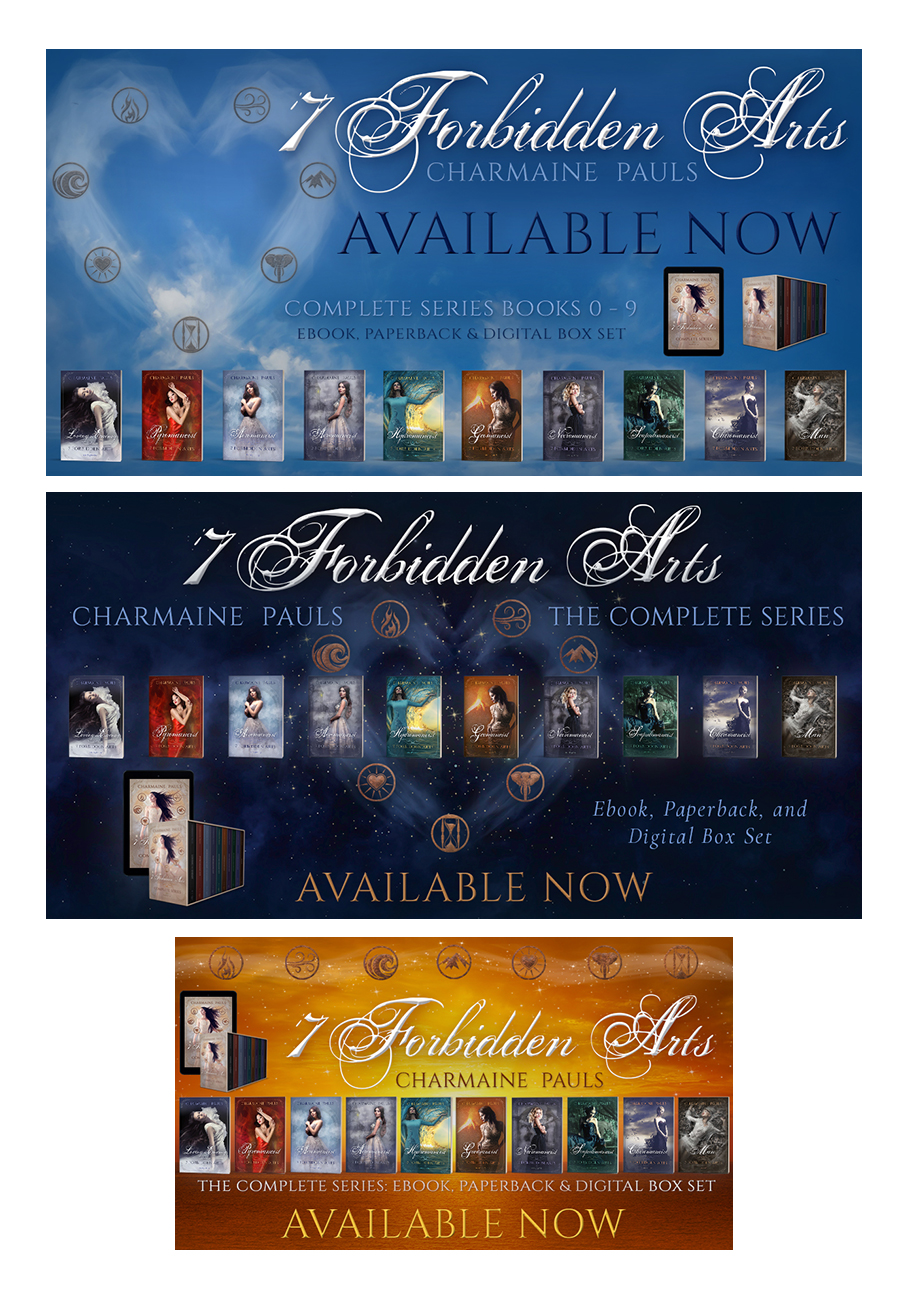
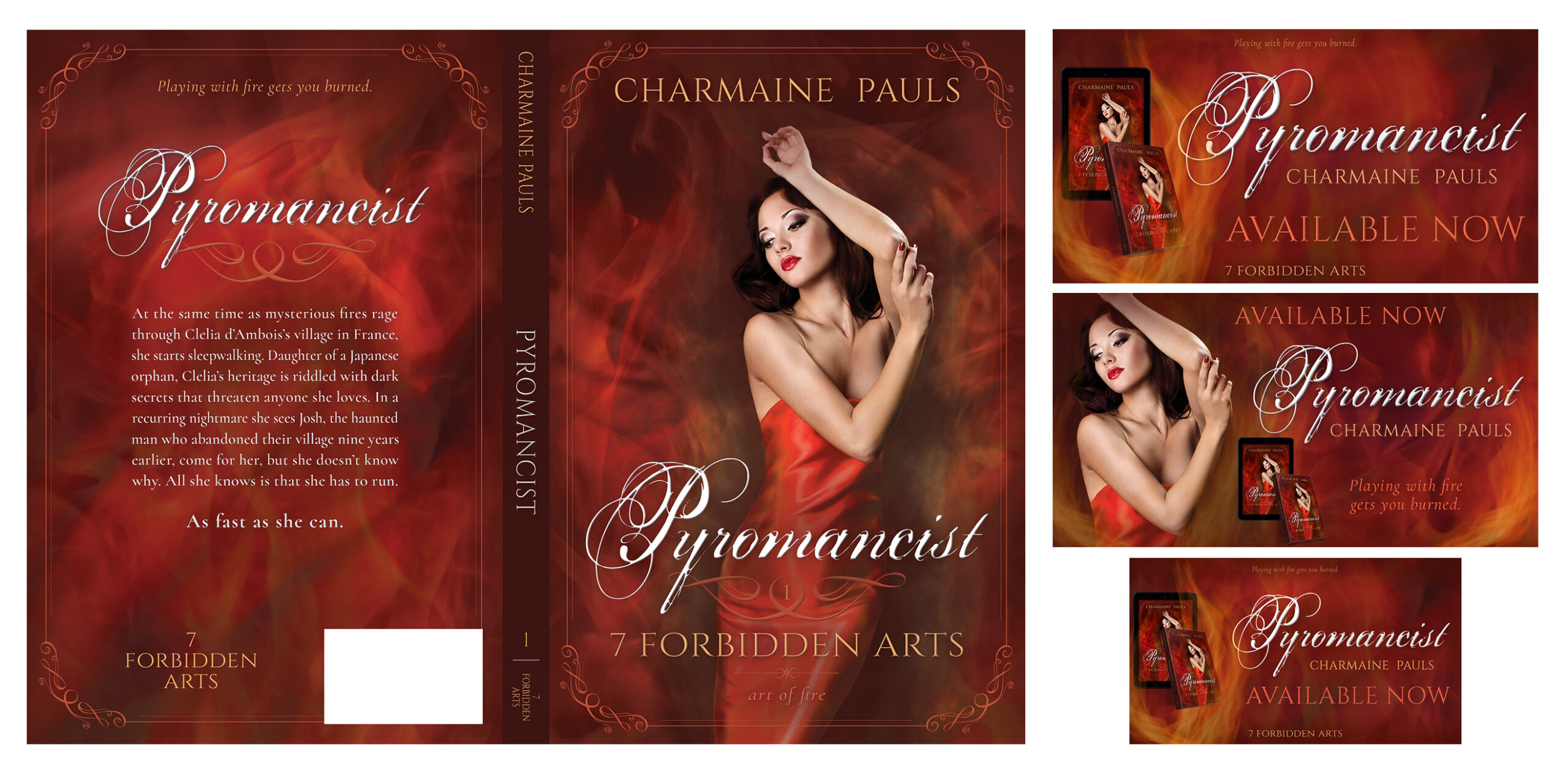
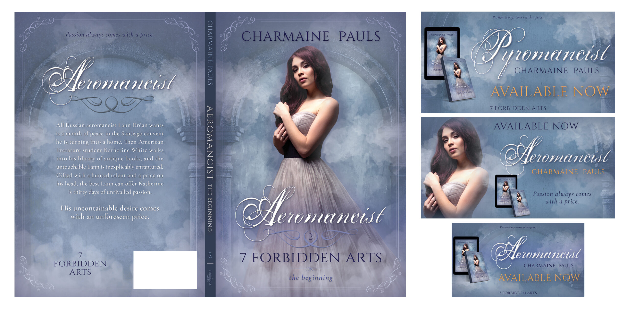
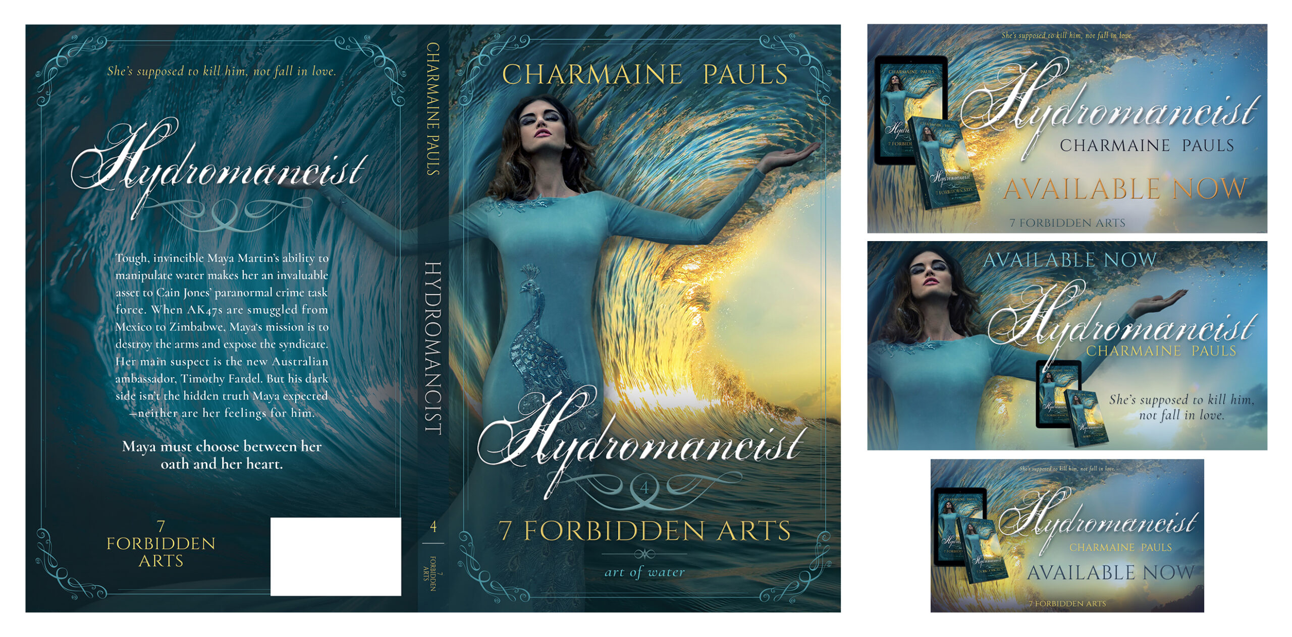
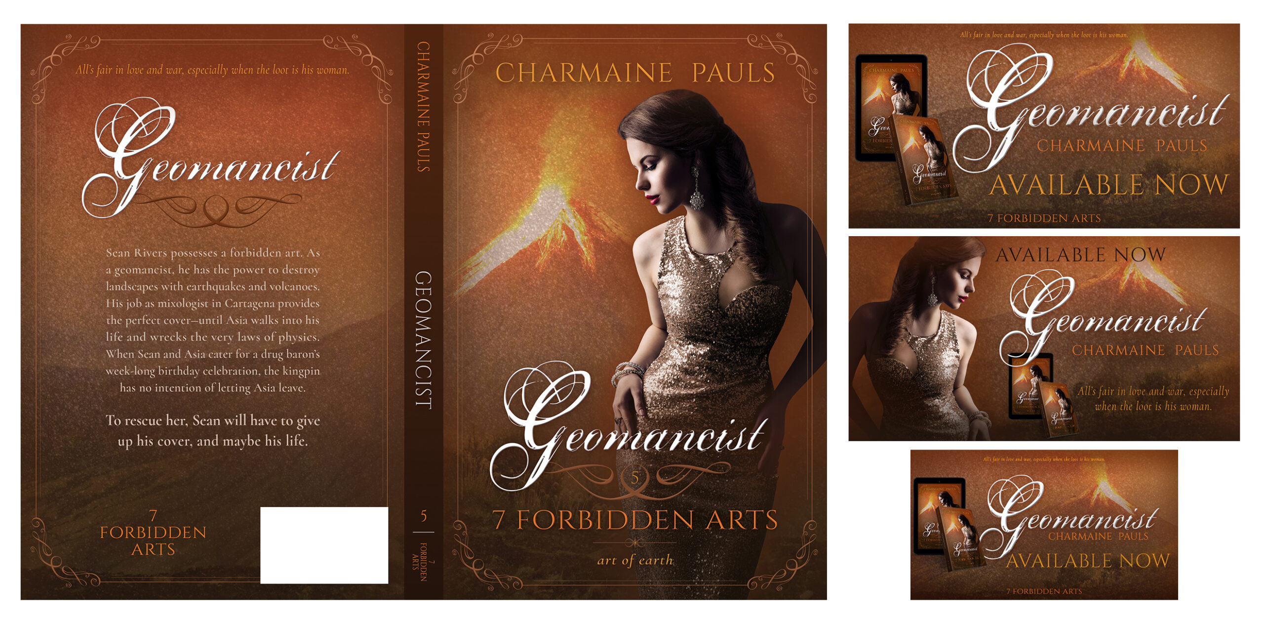
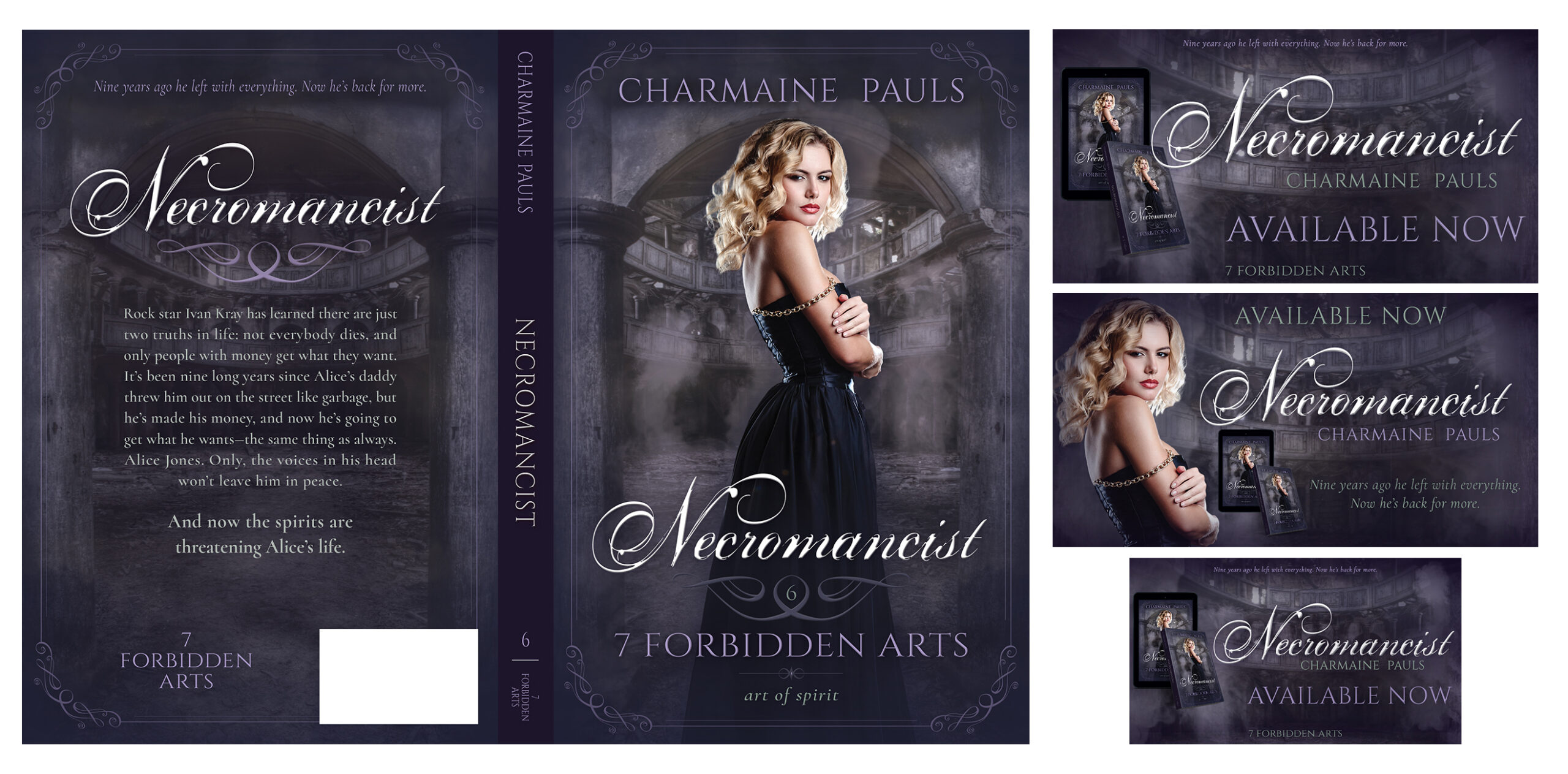
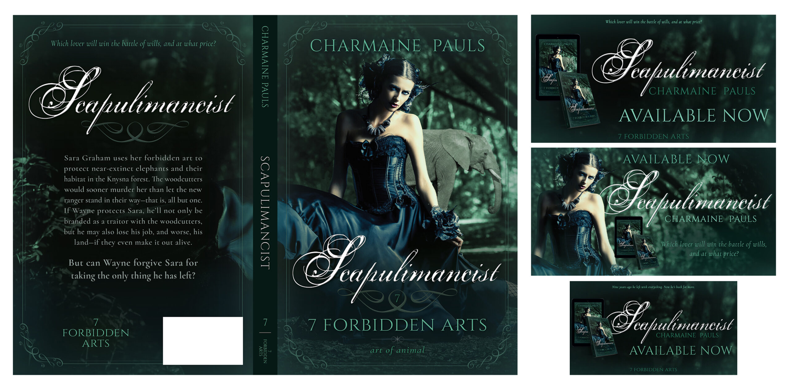
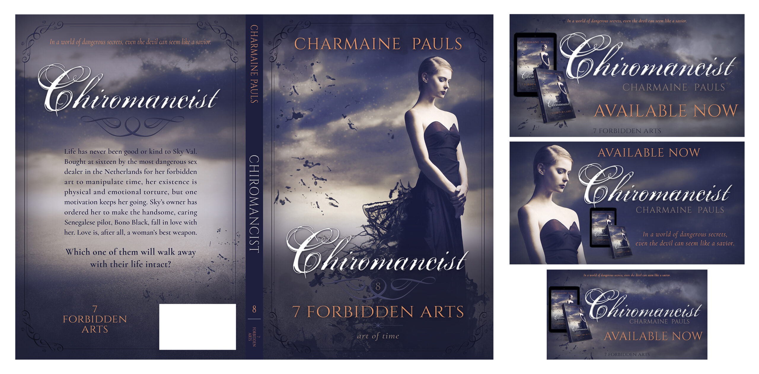
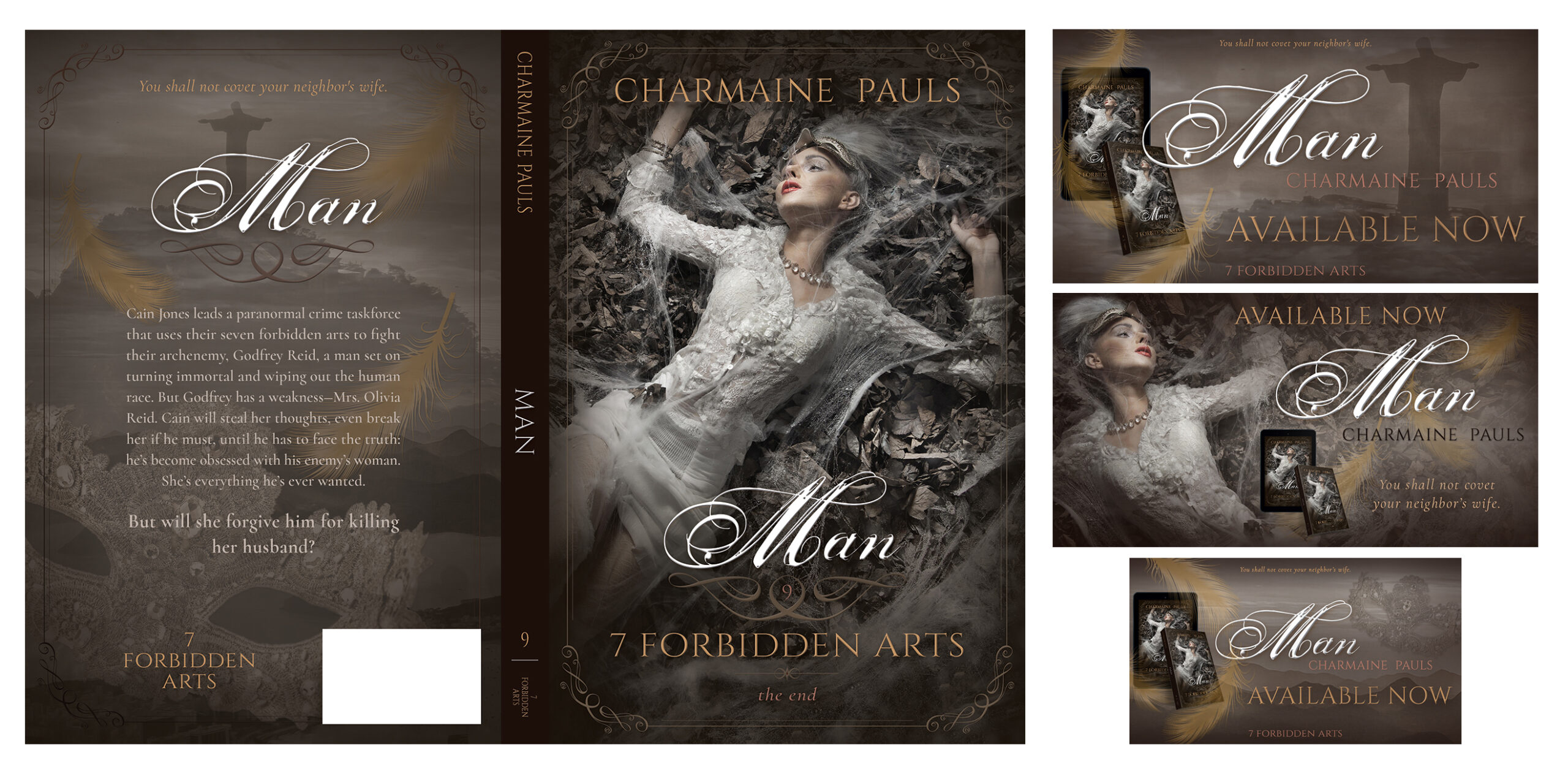
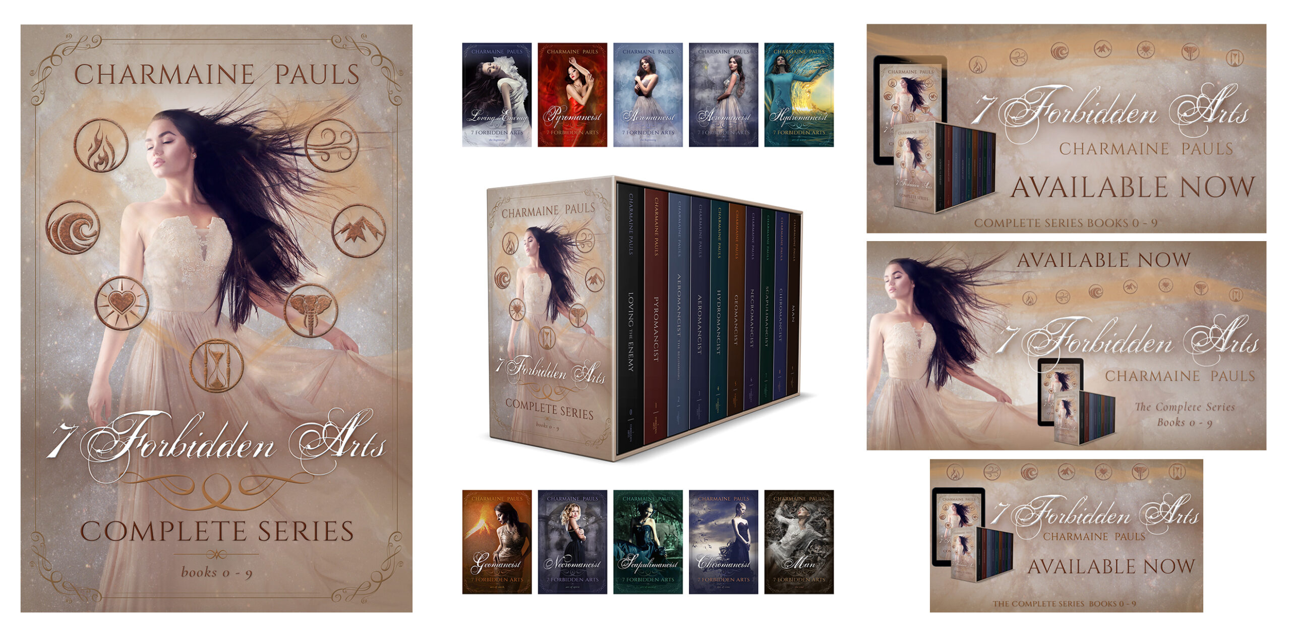
7 Forbidden Arts
When Charmaine Pauls gained the rights to her 7 Forbidden Arts series, she wanted to replace the publishers’ covers, which were more suited to erotic titles, with ones that highlighted the romantic and fantasy elements. We started with a consistent theme of heroines in beautiful flowing dresses in dreamlike backdrops and an elegantly rough script that suited paranormal romance with a bit of gritty action and suspense. Then we added delicate framing and lush jewel-toned color with accents of gold and platinum to visually communicate genre themes of classic romance, plus a few custom-designed ornaments to dress up the titling.
See the case study of the 7 Forbidden Arts series design process at michfisher.com


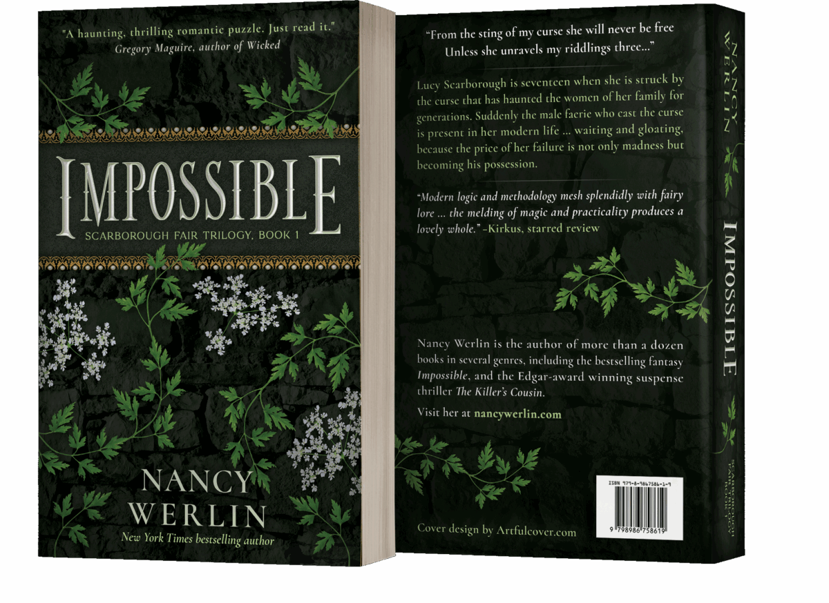
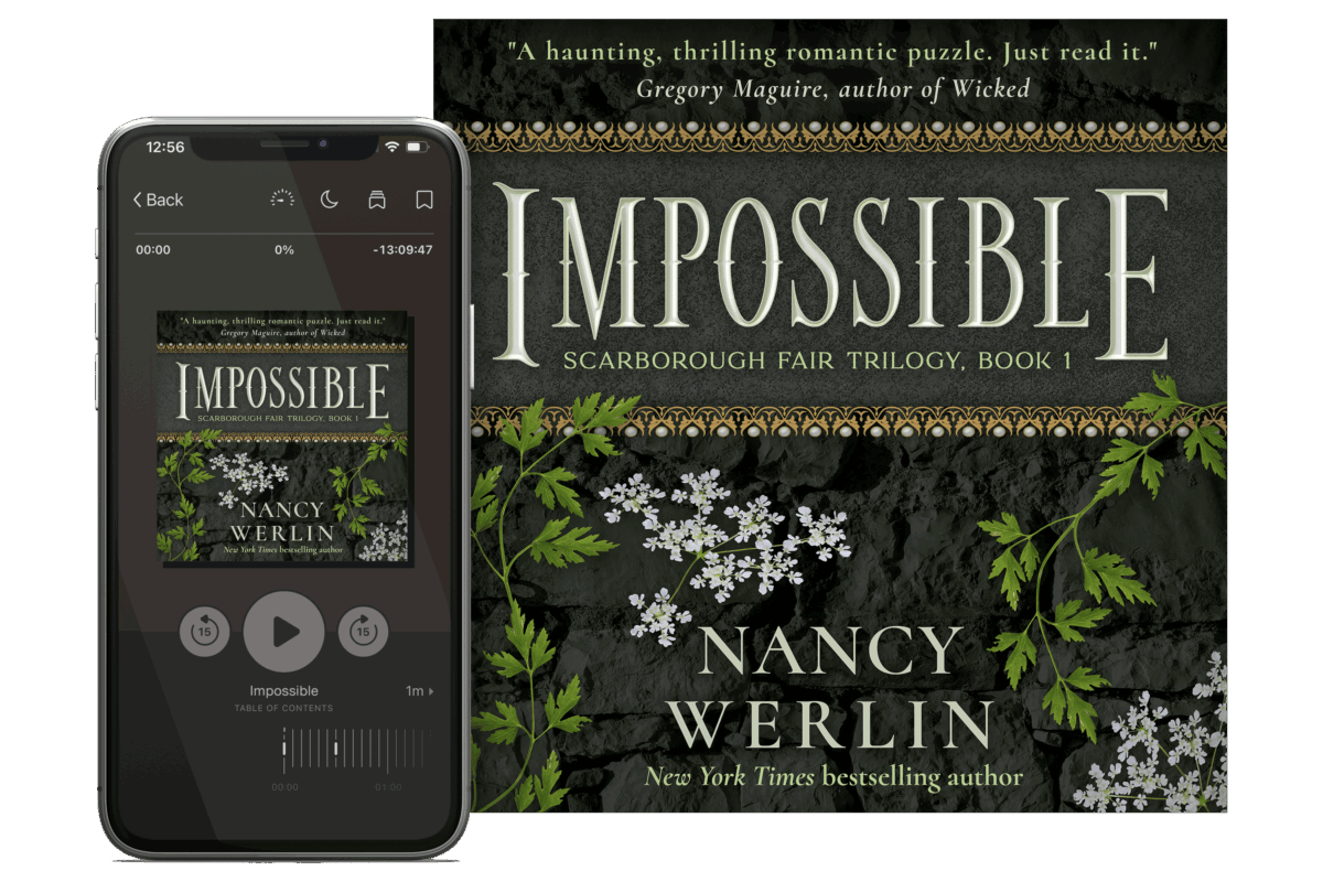
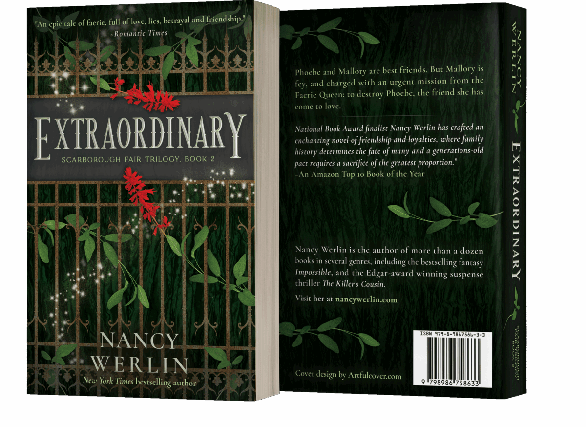
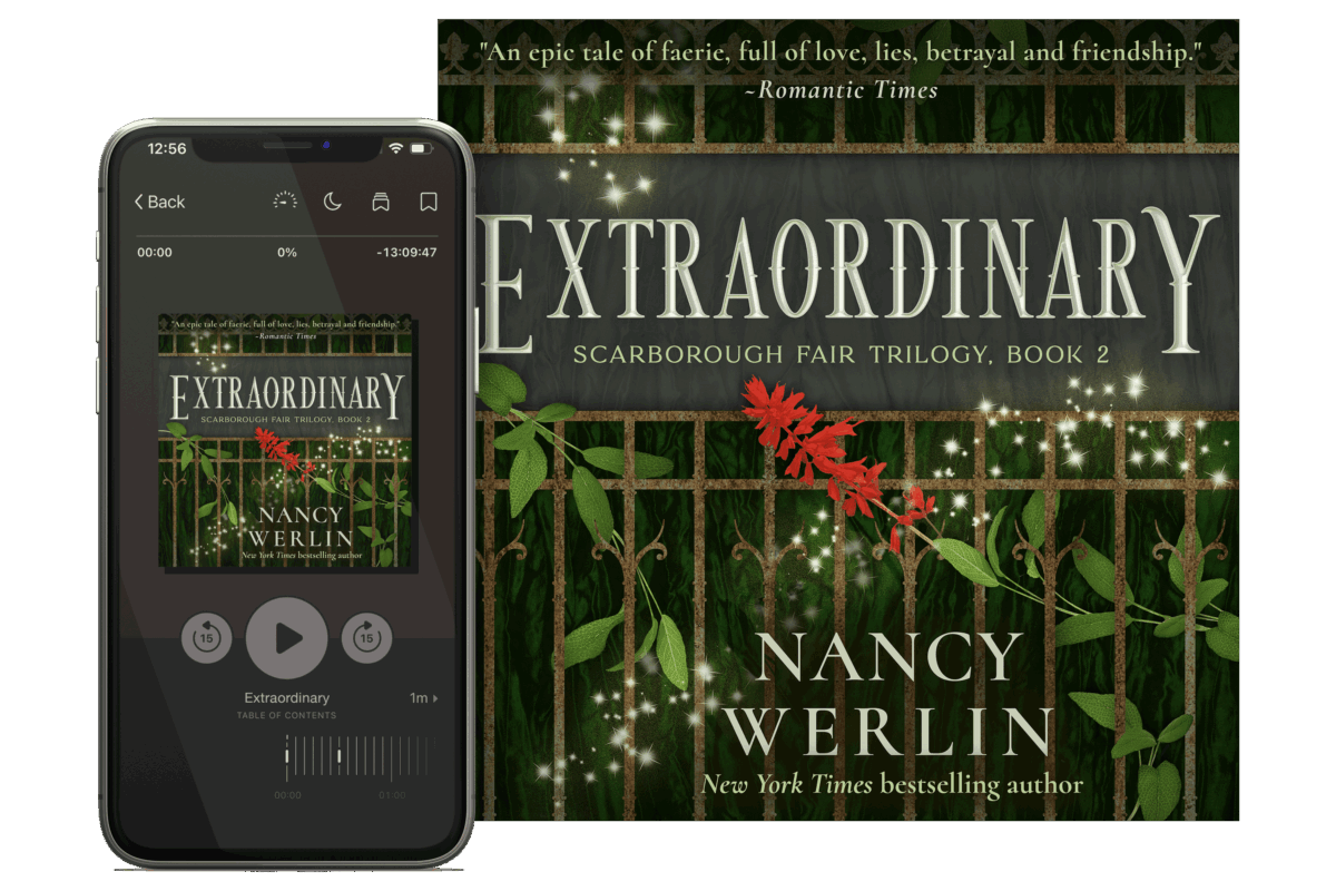
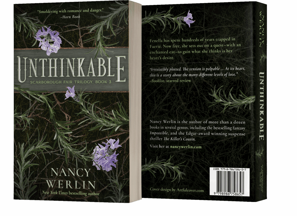
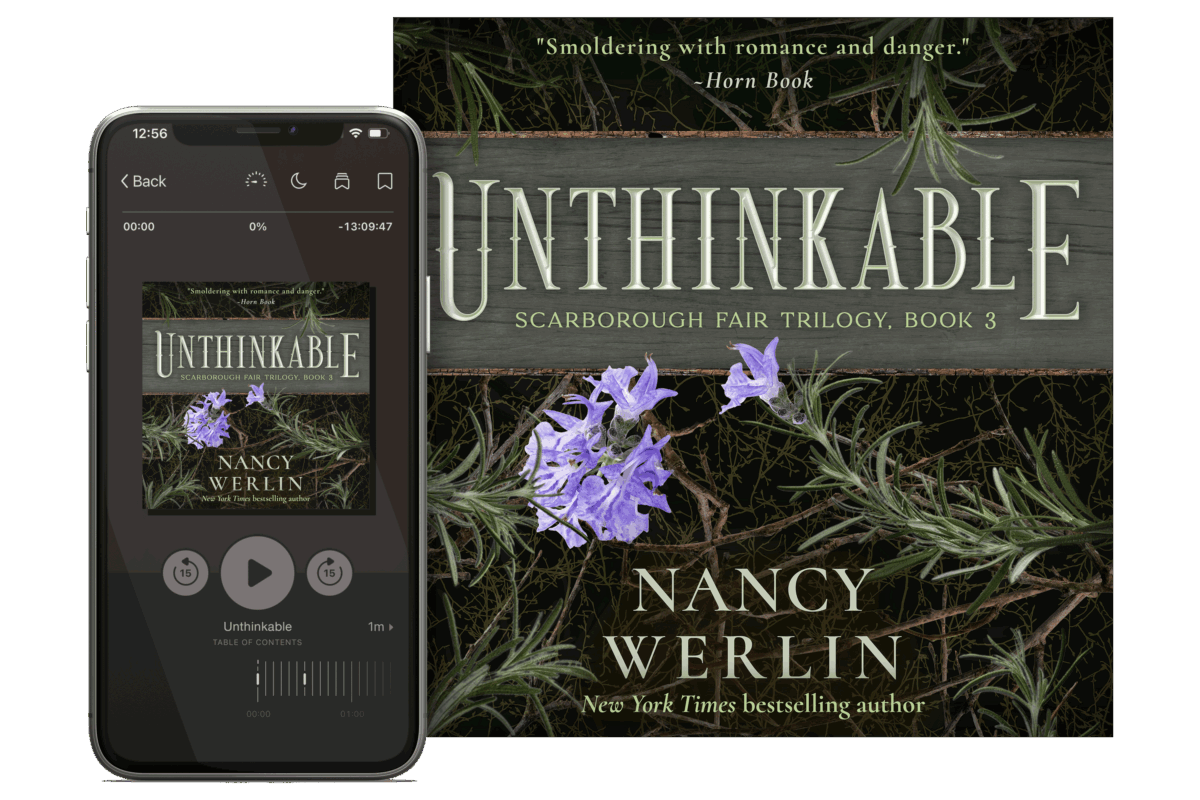
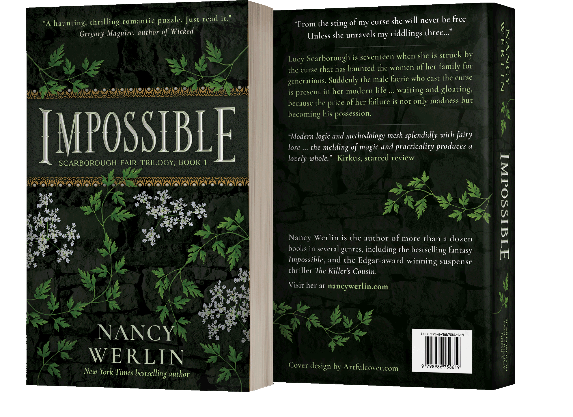
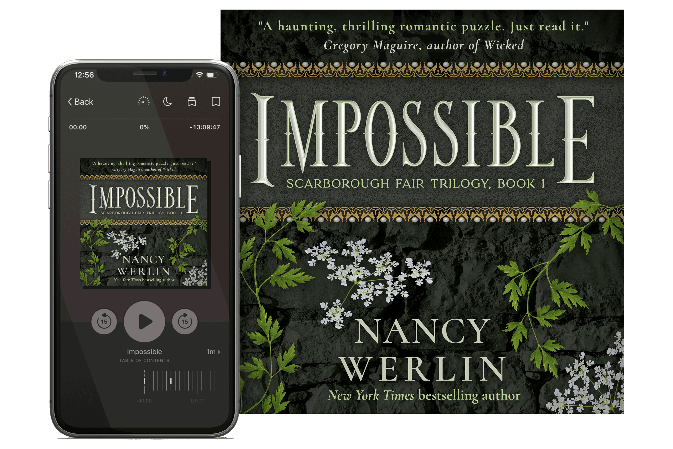
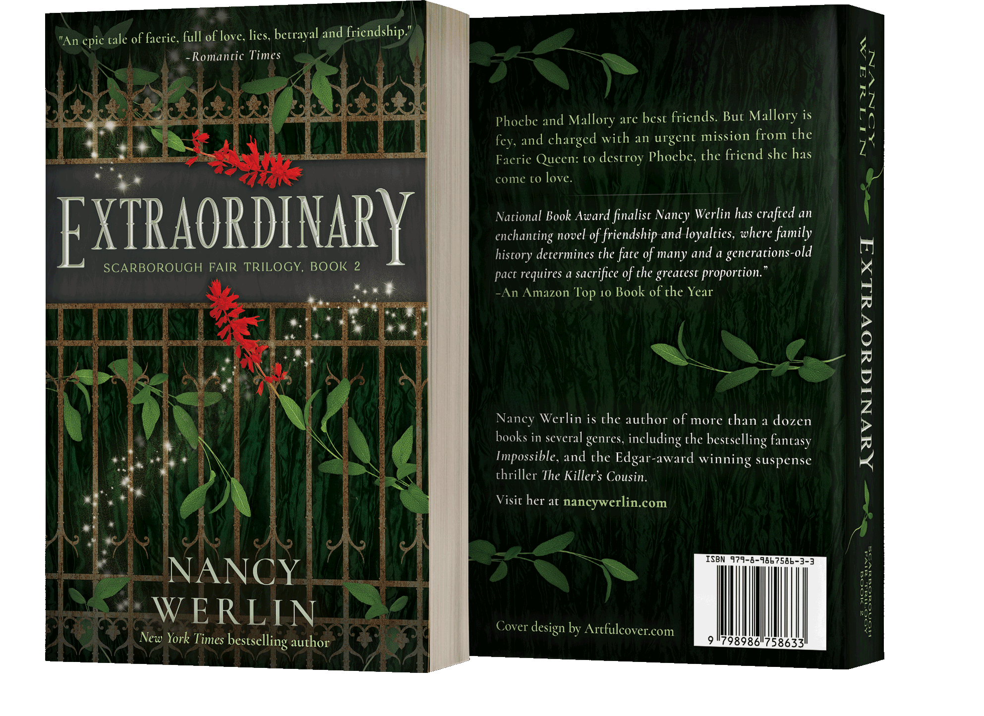
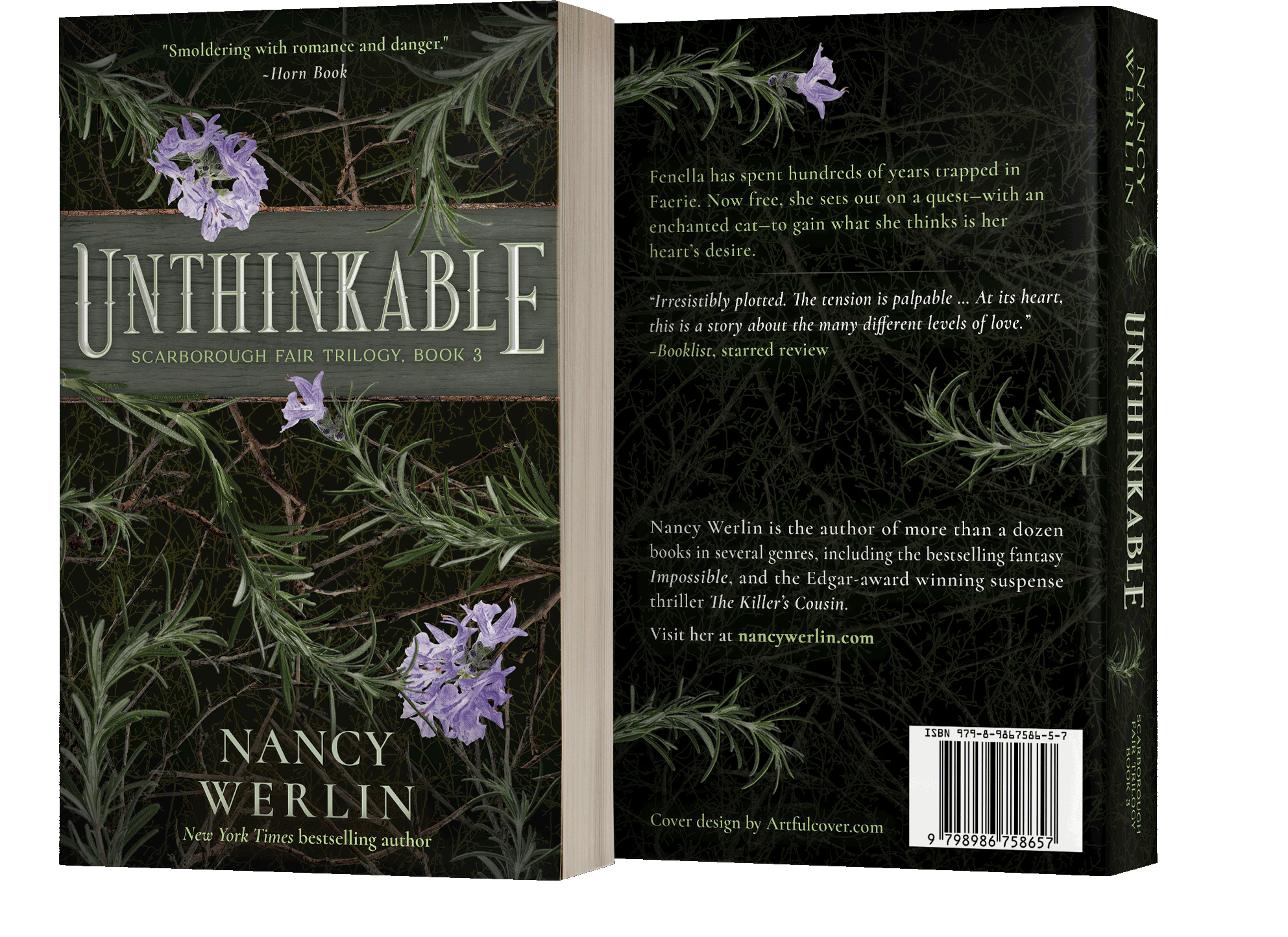
Scarborough Fair Trilogy
For her crossover YA/adult series, Nancy Werlin wanted to shift to a more timelessly iconic look that — like her stories — weaves contemporary tangible reality with threads of fantasy, magic, and darker themes. With the legendary song as inspiration, we started the process of drafting concepts using the herbs and flowers of parsley, sage, and rosemary as the primary design elements with green as a base and white, red, and purple as accents for the three covers. Since threats and curses by the fae factor heavily in the stories, I incorporated natural elements into the themes — stone, metal, and wood — and used them as backdrops for the herbs to create imagery that suggests the beauty, snares, and imposing danger of an enchanted forest. Then I added a title font with a classic fantasy style and thorny character to reinforce genre at a glance.
Case study of the Scarborough Fair Trilogy series branding design process coming soon at michfisher.com


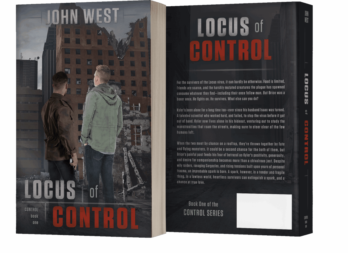
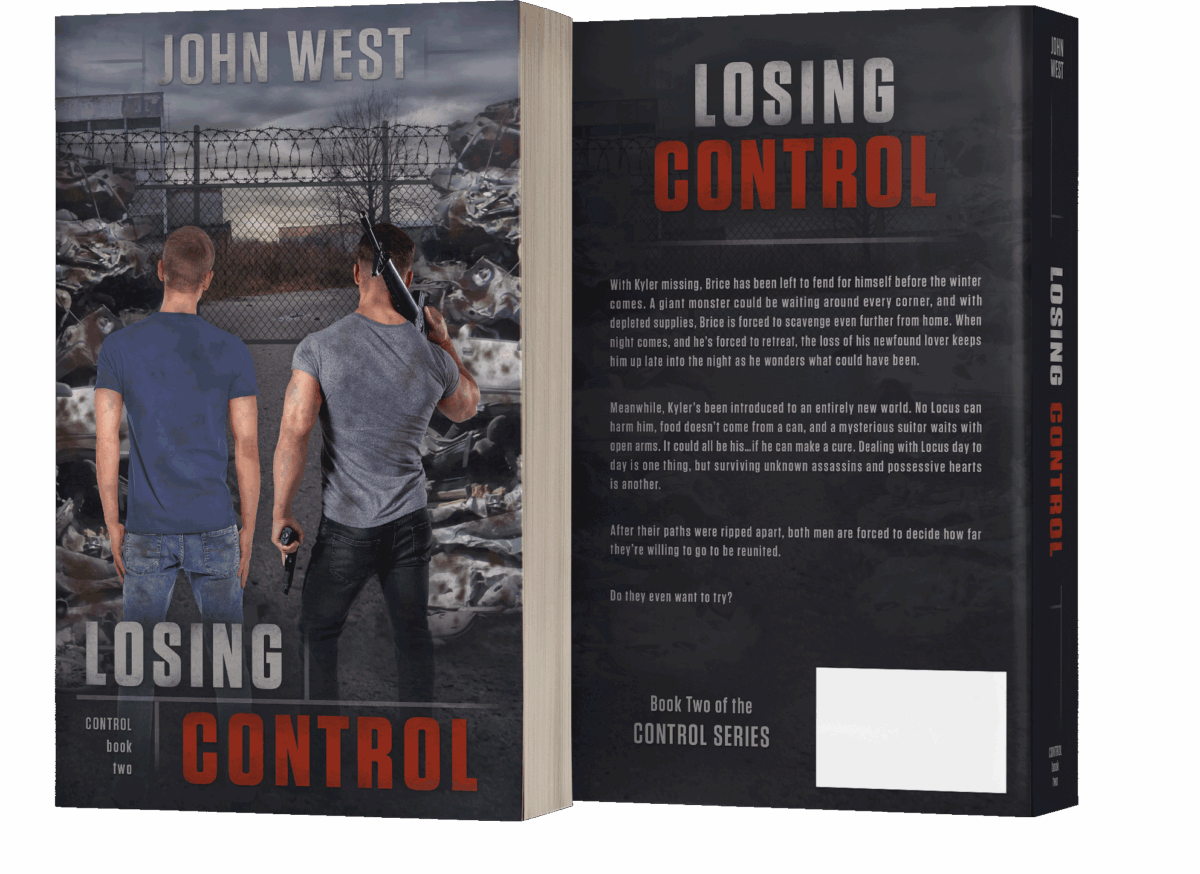
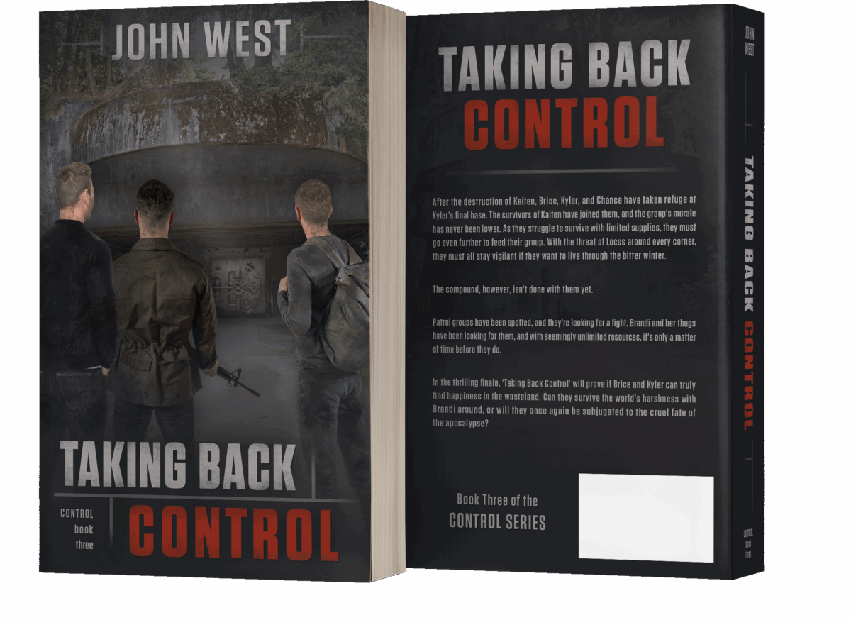
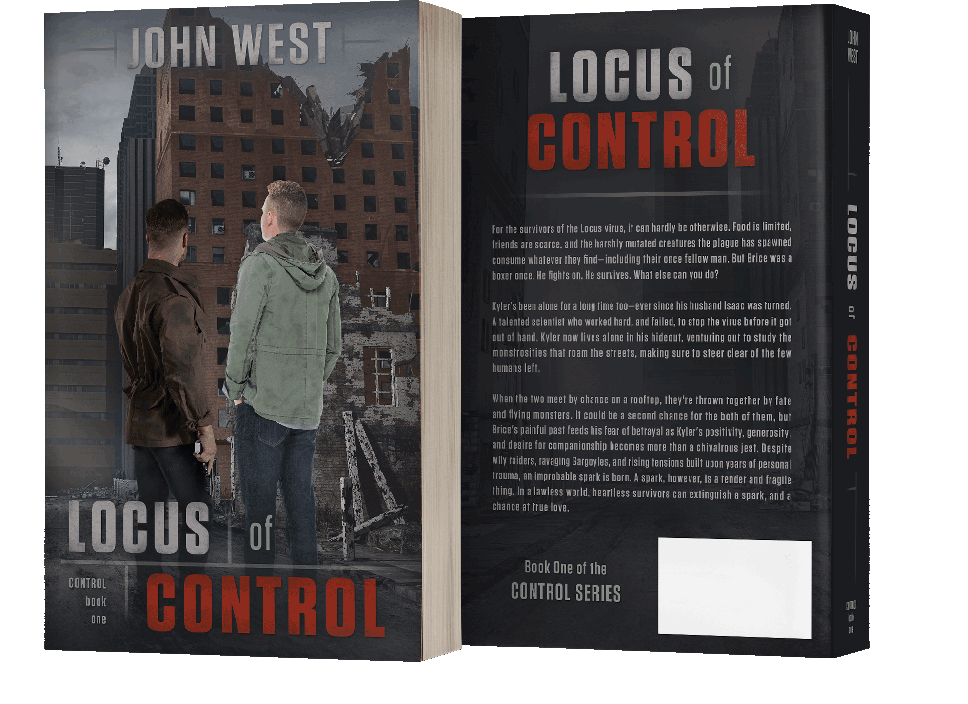
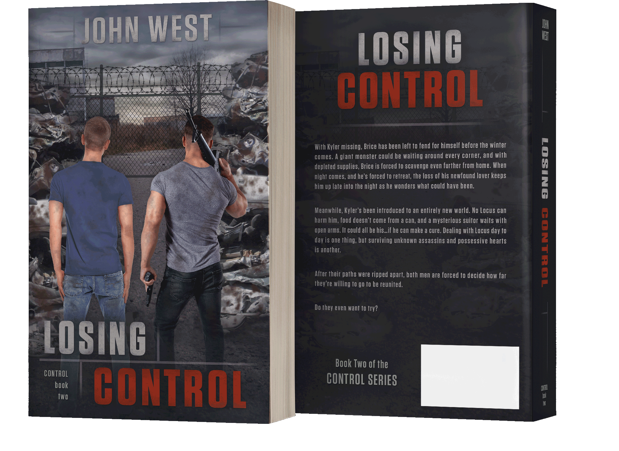
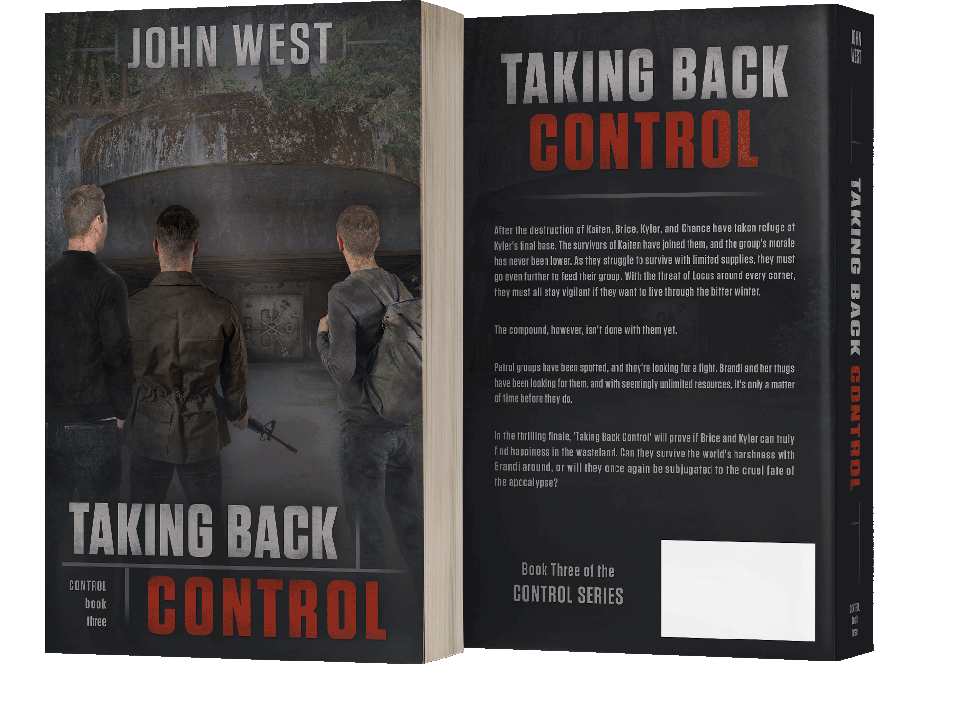
The Control Series
For John West’s Control Series, the primary challenge was not leaning too hard into a science fiction or dystopian style, since the stories are a slow burn romance, at heart. John wanted to recreate the look of his books’ world, which is ten years into a zombie apocalypse, so we homed in on showing the main characters facing the destruction and dangers of a fallen civilization together. I used the linear modular patterns of brick buildings to create design elements on the cover and spine, and used a squarish font that hearkens to city and road signs for titling and text — with a touch of grit and splash of red to underscore danger.
See the case study of the Control series design process at michfisher.com
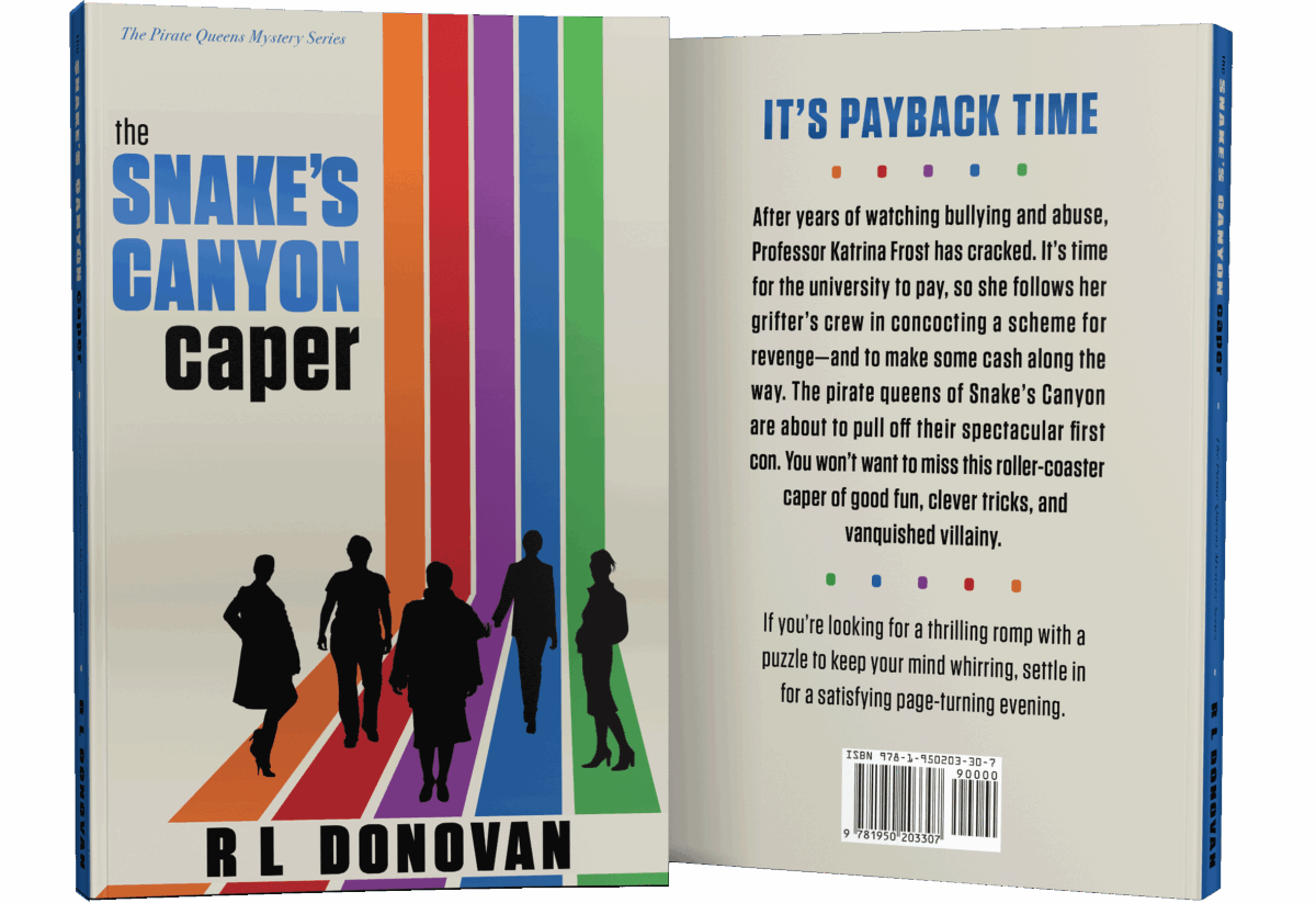
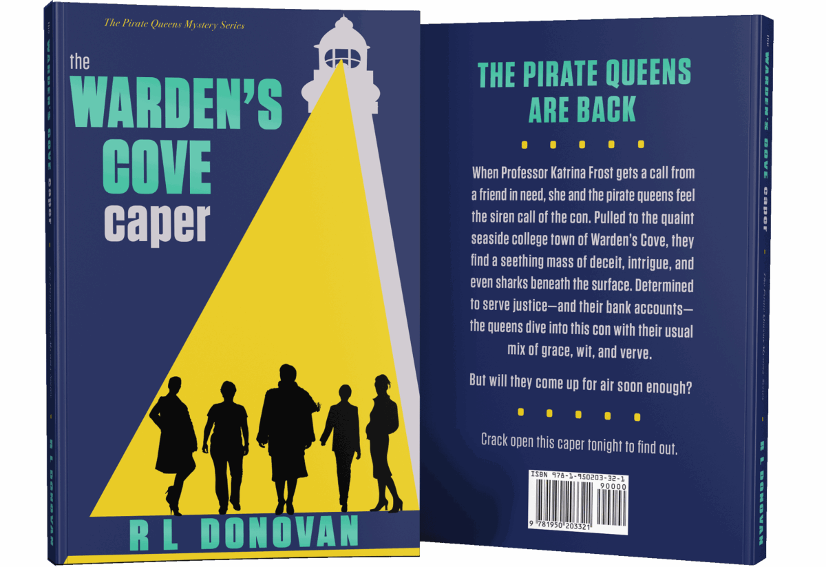
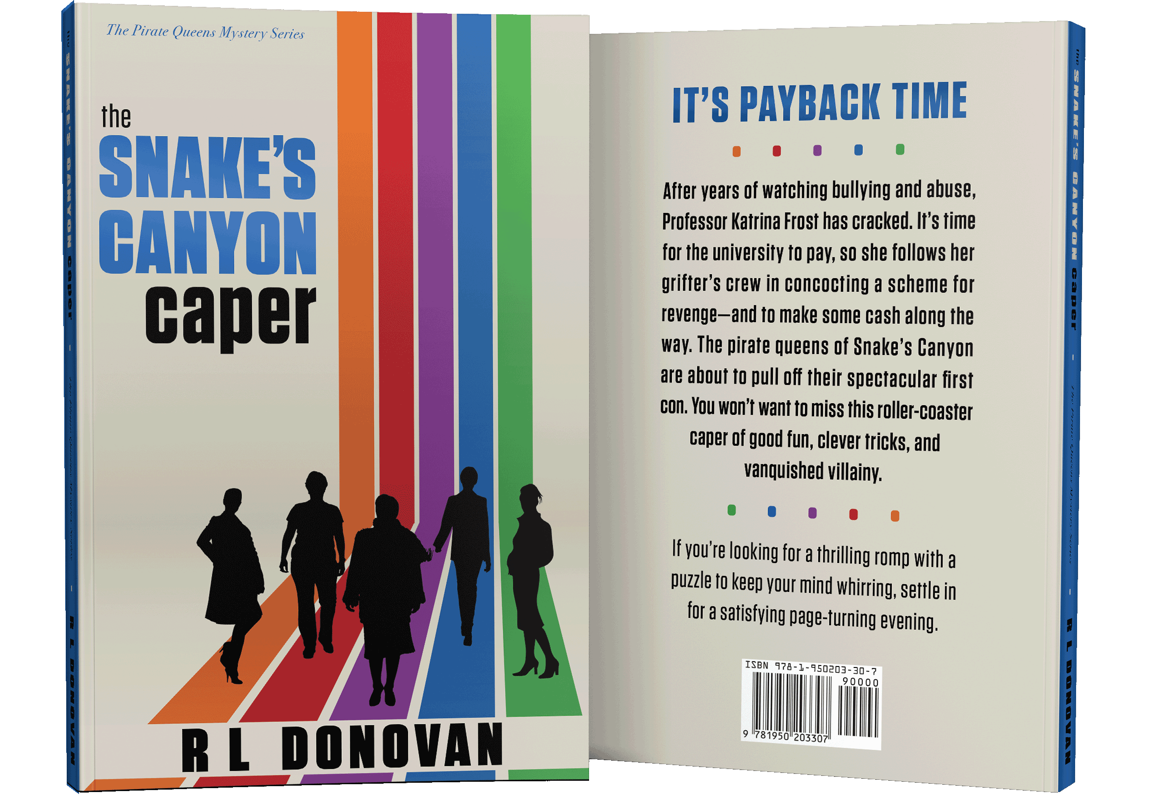
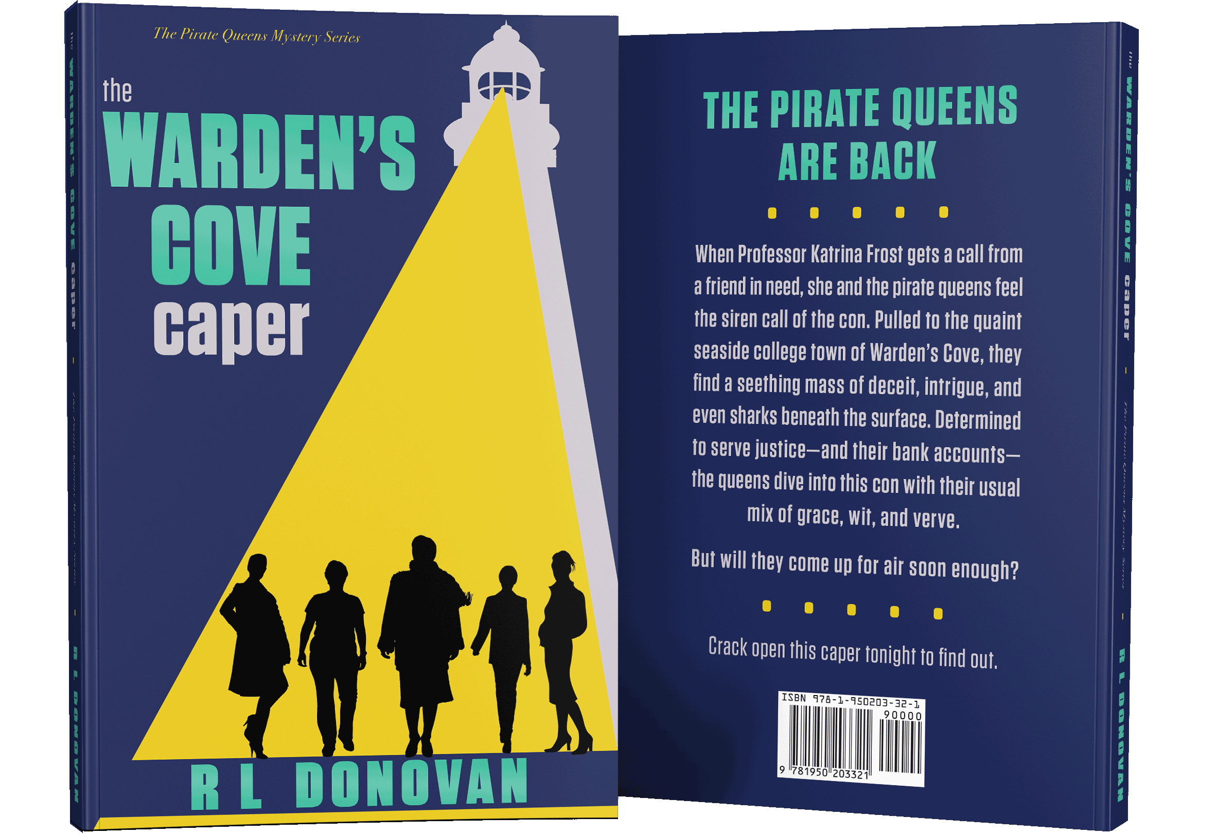
The Pirate Queens Mystery Series
The concept design of R L Donovan’s Pirate Queens Mystery Series started out as a premade book cover. To better suit her story, we replaced the silhouettes with ones that matched her characters, added a dash more color, and did a few minor design tweaks. In designing the cover for book two, we wanted to continue the classic simplicity and clean lines of the existing look. The spotlight and lighthouse played on the lines of the rainbow-colored rays of first cover, while adding a hint of danger and mystery to the theme.
See more details about The Pirate Queens Mystery Series design process at michfisher.com
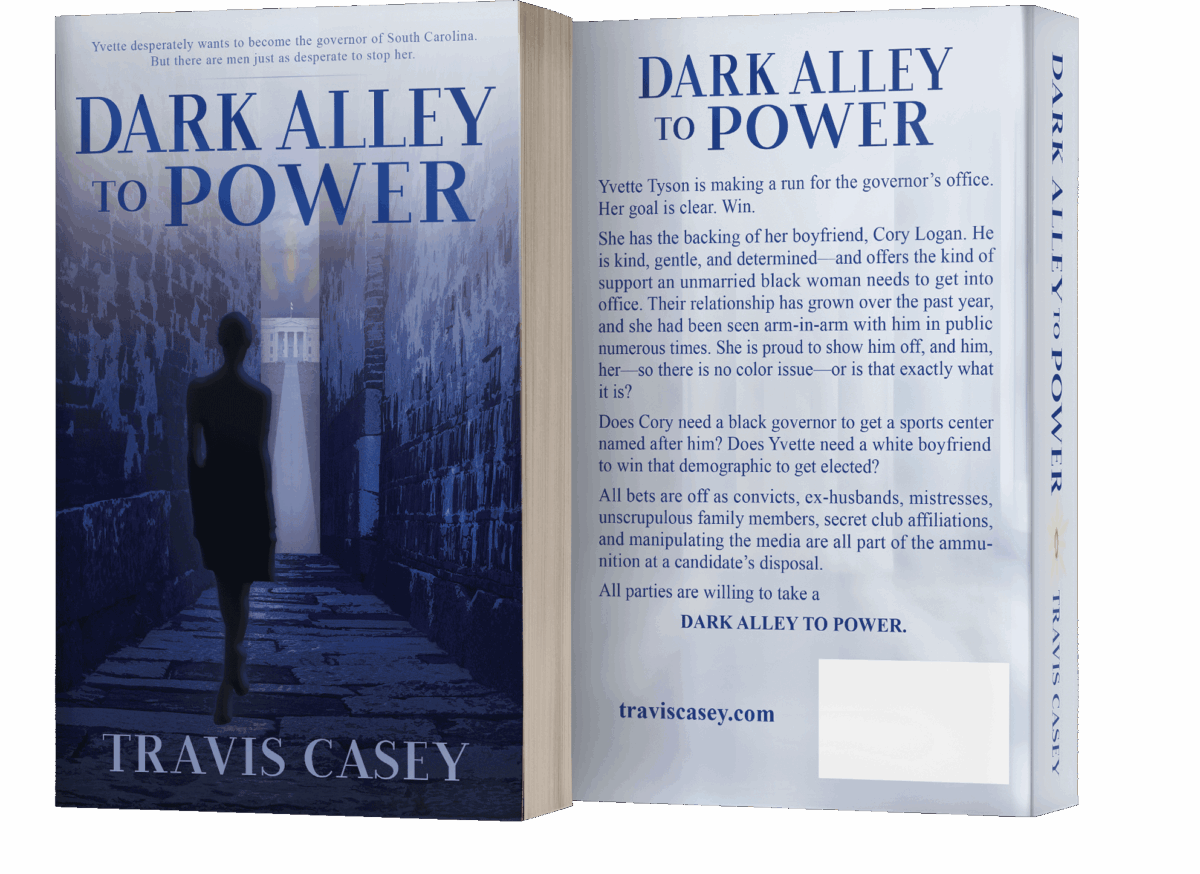
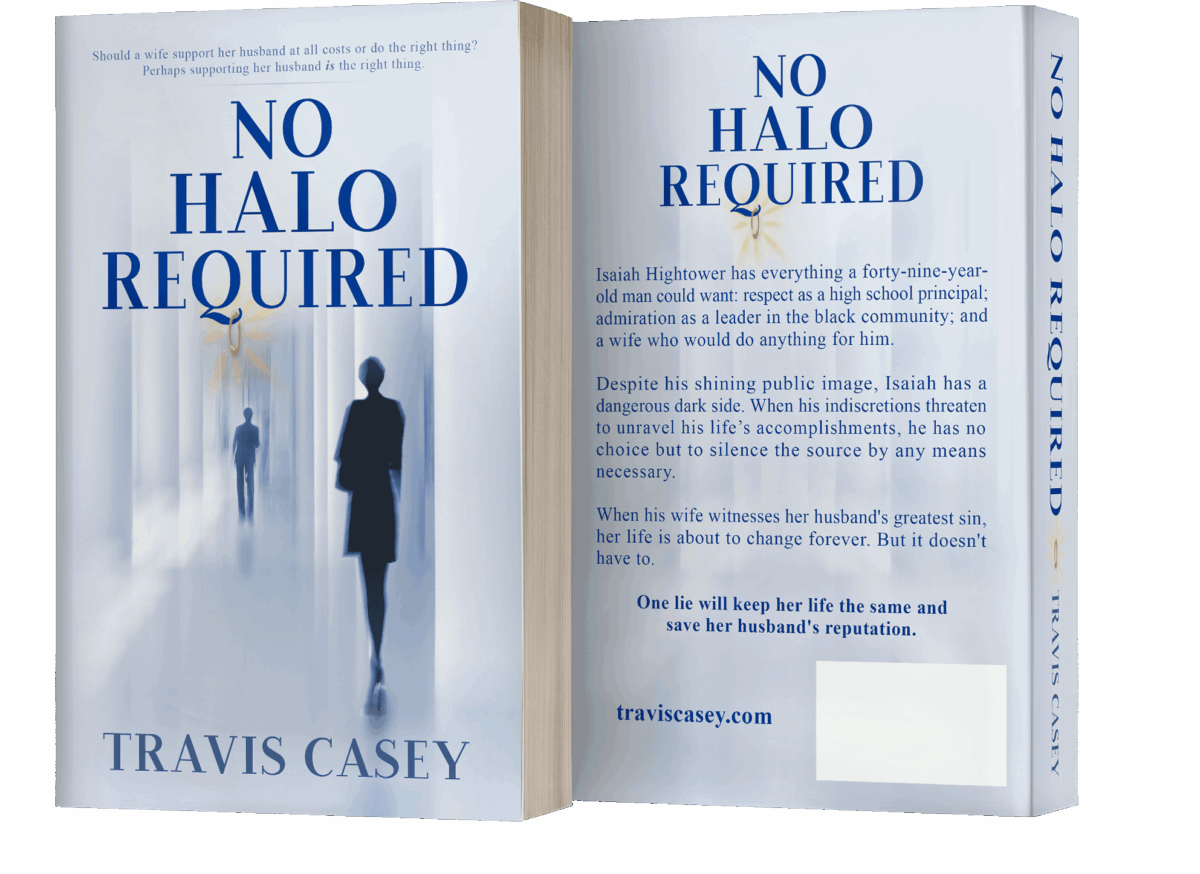
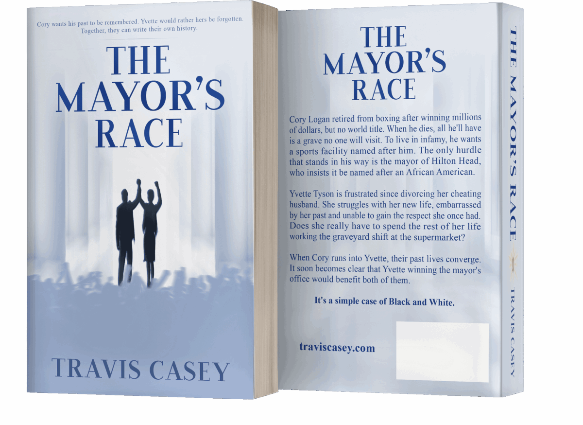
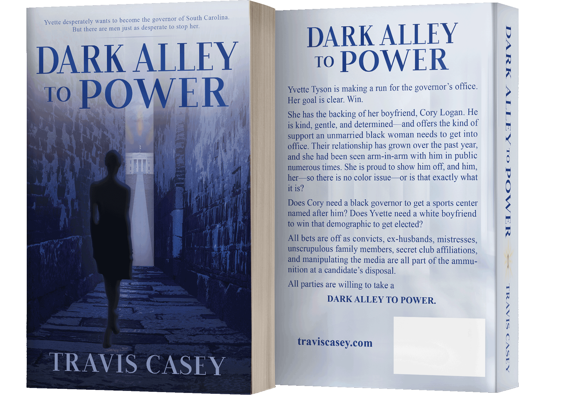
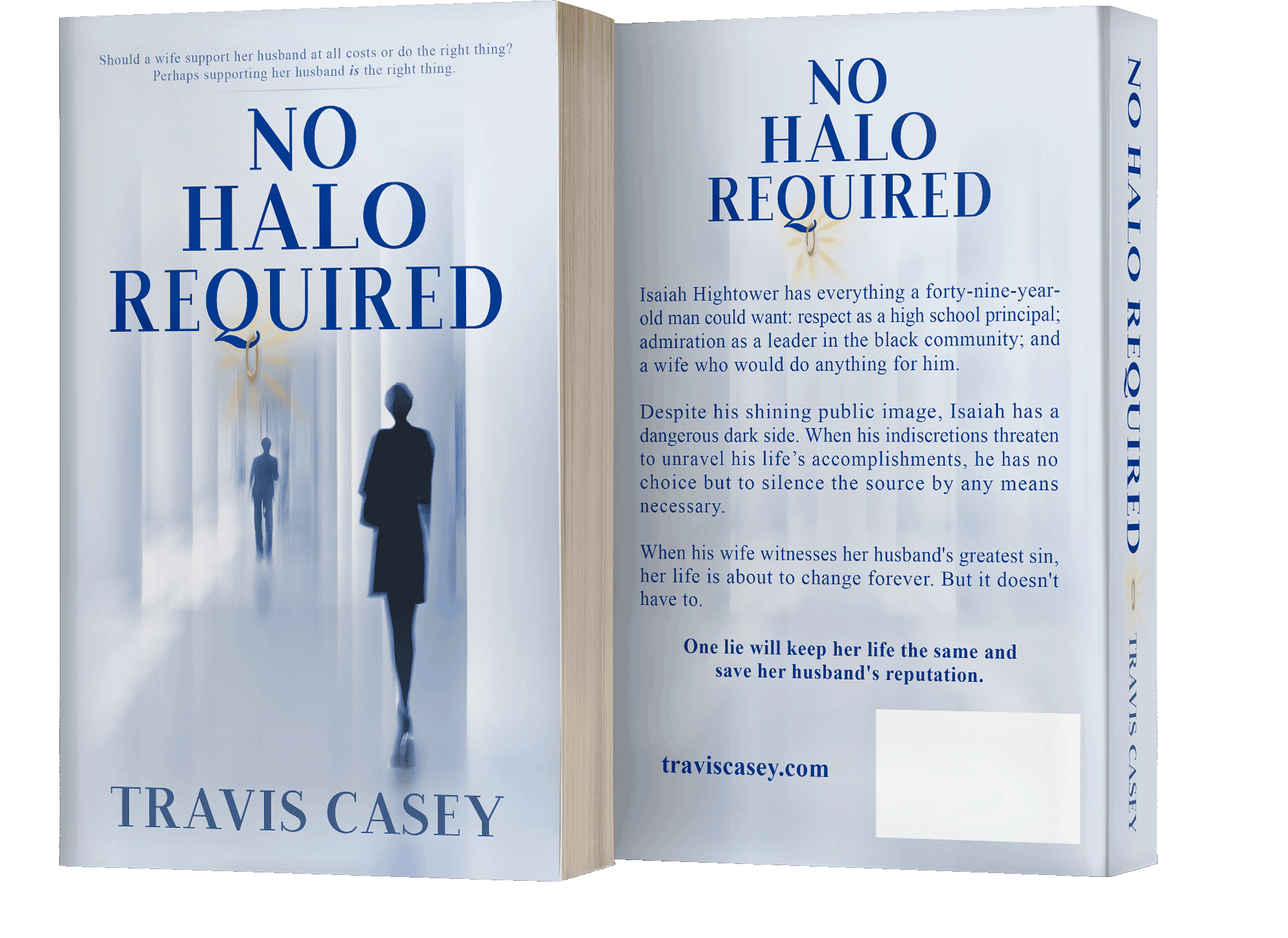
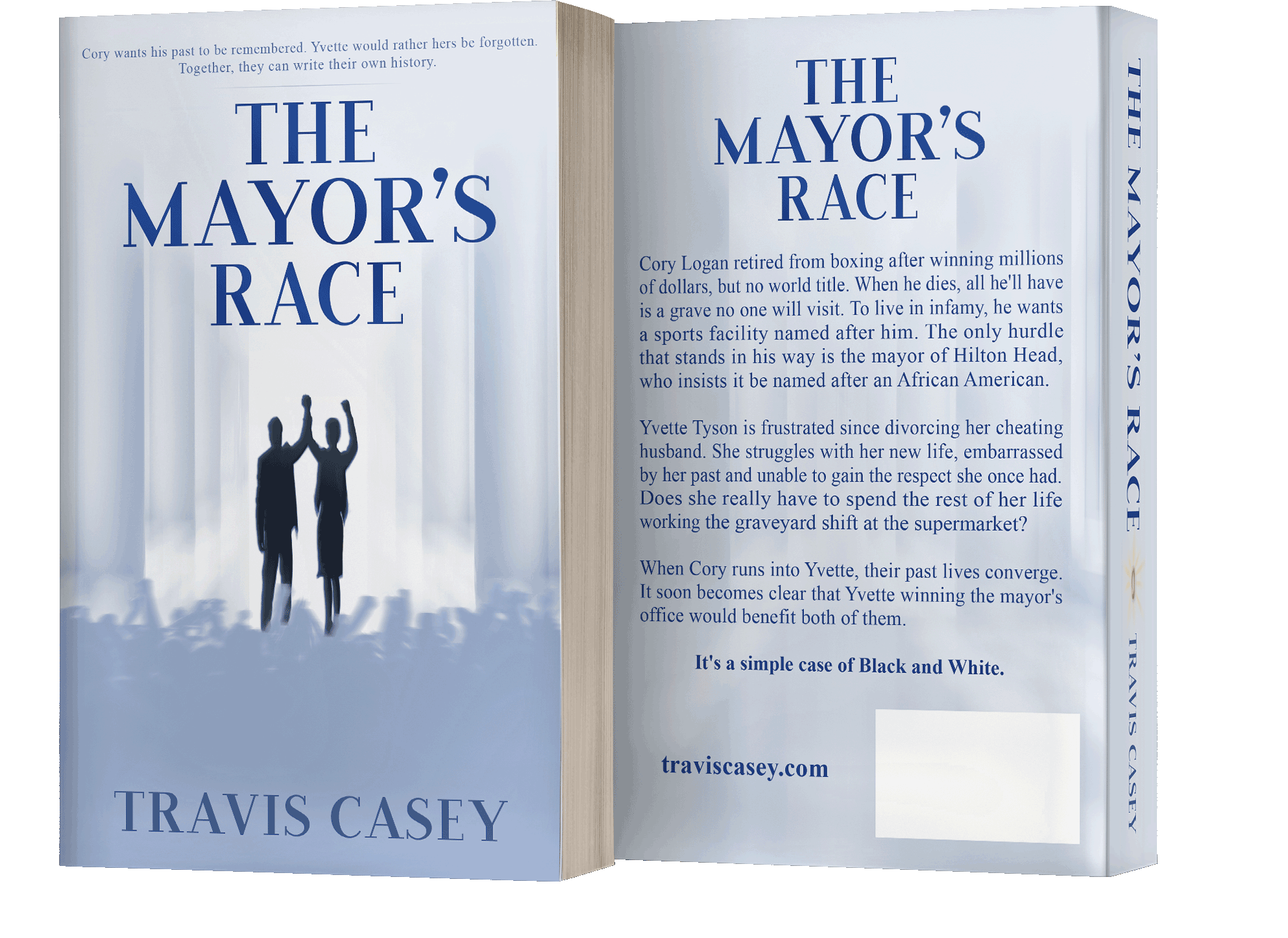
No Halo Required
The series that grew out of the (formerly premade) cover design for No Halo Required focused on the moral quandaries and grey areas in personal and electoral politics. So, in designing the series concept, keeping the iconic almost monochrome shades-of-grey look was a pretty easy call. As was isolating the pillars of the halls of power that provided a core of the visual theme. Other aspects of the original design joined the series look as Travis Casey and I collaborated on the branding. The abstract style of the characters was never in doubt, but after trying other approaches, I always came back to distant silhouettes. This let the protagonists start as symbols of an idea, to be defined by the reader as the story unfolded. Also, even when I varied from the pillar backdrop on the third cover, I still wanted to convey the feel of a closed — possibly narrowing — path that mirrors the inevitable course resulting from the characters’ choices.